Can your website deliver on that promise?
Forget your elevator speech. It’ll take you more than 0.05 just to open your mouth. It’s a ridiculously short amount of time to get anything done, but it’s exactly how long it takes someone to form a first impression of your website.
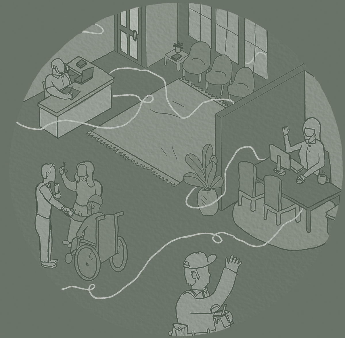
The first impression a website makes is critical for any organization. For housing authorities, it can mean the difference between folks starting their housing journey with you and moving on — remaining unknown to you and feeling unhelped.
Take a look at your website, put yourself in the position of a potential resident and ask yourself the following questions:
1. Is your website’s perspective agency-out or resident-in?
Most municipal websites are built from the perspective of an agency teling the public what it does rather than working to engage the public based on what the’re looking for.
As quasi-governmental agencies, it’s easy for housing authority websites to look like government websites. Many are simply tacked on to existing city or county websites. Each department and every program gets equal home page real estate. The challenge is, when folks are looking for affordable housing help — they might not know what program they qualify for, they just know they need help, and they need it now. When faced with too many choices, potential residents can drop out before you have the opportunity to help them.
When folks are looking for affordable housing help, they might not know what program they qualify for — they just know they need help.
2. If you remove all verbiage, does your site still convey your mission?
Take a screen capture of or print out your home page. Now go through and black out all the text. Does your website now look like a top-secret CIA file with redacted content? Does it still create a sense of your organization? Photography, illustration, color, shape and user interface design can all help visually convey your brand ethos and create a positive first impression — independent of your all-important verbal messaging. Using more than words to set a tone becomes even more critical for site visitors with limited English proficiency (LEP).
3. Does your website engage quickly and easily?
Waiting lists are long. Fifty-three percent of Housing Choice Voucher waiting lists are closed. Housing authorities and those seeking safe, affordable, decent homes face challenges that no amount of branding work can overcome. However, one thing we hear consistently from housing authorities is that once potential residents connect with your housing authority, you can help them move in a positive direction along the housing continuum. If they don’t engage, you can’t help them. This is where your website can greatly improve operational efficiency — helping you help more people.
Do you have clear, concise and prominent contact information on every page? Do you have a simple form and qualifying calculator so potential residents can find out if they are eligable and get the process started quickly?
Check your Google Analytics. What path are visitors navigating to find information on your site? Check your bounce rate — from what pages do folks leave your site most often? Are they leaving because they found the information they needed, or did they give up looking?
A more engaging housing authority website helps you help more people, more quickly and efficiently.
4. Does your website reduce the stigma around affordable housing, or perpetuate it?
The stigma around affordable housing not only makes it more difficult for you to rally community support, it can also scare off the people you’re here to help.
Does your website exude bureaucracy or compassion? Do you talk about jurisdictions or communities? Projects or apartments? Units or homes? Section 8 or Housing Choice Vouchers? If the most prominent call to action is a link to report fraud, what does that say to the overwhelming majority of law-abiding residents in need?
How do you capture search traffic from those who still use the term Section 8 without perpetuating stigma and extending the life of an outdated program name? How can your website instill a sense of relief in the hearts and minds of those facing their own personal housing crisis? How does your website convey to the community at large that you’re doing important work on the front lines of housing affordability?
5. Does your website accurately and positively represent your organization’s culture?
Your website is not only important for creating a first impression with potential residents. Community partners, development and investment partners, and prospective employees also check out your online presence to get a feel for your organization. We’ve conducted extensive department-level and individual interviews with housing authority employees and often hear they had a less-than-positive impression of the housing authority prior to their job interview based on their online research.
How many potential employees visit your site, then drop off before applying?
Does your site talk about jurisdictions or communities? Section 8 or Housing Choice Vouchers? Units or homes?
Your first chance is your best chance
As you’re reveiwing your site, don’t forget functionality. Load speed, content that reads well on all devices — large screens to mobile phones — and a user-friendly interface are crucial for engaging and keeping visitors on your site.
Understandably, as a housing authority, you focused more on doing your work than building their brand. But as your work to address housing affordability evolves, the way people feel about what you do will increasingly affect your ability to do what you do. A clear, compelling and inspiring housing authority website will make your organization look and sound as good as it really is and strengthen your ability to provide innovative housing solutions for current and future generations.
About Tom Campbell:
Tom is Toolbox’s co-founder and creative director. When he’s not keeping the ‘Box rocking, Tom can be found backstopping his beer league hockey team or playing drums for local bar bands. He’s also a founder and fairy godfather of Art Lab Fort Collins and keeper of TomLovesTheLibertyBell.com, a quirky repository of stories and stats on Liberty Bell replicas around the world.
About Toolbox Creative:
Toolbox Creative is a B2B Brand Engineering firm, helping mission-driven organizations assess their brand equity, clarify their positioning and amplify their voices — creating lasting impact and building brand love.